Type: Team project | Client: Airthings | Timeline: 2021 (2 months) | Role: Product manager
Enabling users to receive intuitive and digestible weekly summaries of their indoor air quality.
Scroll ↓
How might we better inform and educate Airthings’ users about their indoor air quality trends?
Brief
During my time as a Product Manager Trainee at Airthings, a global technology company developing world-leading indoor air quality solutions, one of my responsibilities was scoping a project to be worked on by the incoming summer interns and leading the team of 5 designers and developers in launching a new feature for Airthings B2C and B2B platform.
The problem we were solving for: while data from Airthings’ devices is presented in detail on its platform, an essential improvement potential was making everything more digestible and better highlighting how the air quality is specifically affecting users, what causes indoor pollution, and how users can do something about it.
Role
My role as a product manager involved scoping the project; developing the product strategy, facilitating efficient collaboration between the designers and developers; communicating our aims, challenges, and progress to the broader firm; and contributing to hands-on technical work in UX design and web development.
Tools used: Jira / React JS / HTML & CSS / Kotlin / Figma / Github / Bitbucket / Litmus / Mixpanel / Amazon S3.
Outcome
We successfully launched a feature allowing B2C customers to receive weekly reports intuitively summarising trends, insights, recommendations, and air-quality related information about one’s home or building of choice.
The project outcome and key learnings were presented to the entire global team, including all executives. Our B2B launch was delayed because of technical challenges, which required various priorities to be made.

Finalised design after several revisions due to technical challenges
Problem definition
I led the problem definition phase through qualitative research involving stakeholder interviews, user interviews, and conducting a holistic business analysis (SWOT, VMOST, and PESTLE analysis). This was to ensure the project addressed unmet customer needs, was aligned with the expertise of the incoming summer interns to be part of the product team, and was feasible to complete within the given 2-month timeline.

Key takeaway
While users had a visual overview of their indoor air quality data on Airthings’ platform, they infrequently checked the platform and were frustrated by needing to explore numerous data points to understand if any action was required.
A key nuance was that not all customers, particularly B2C users, understood all the air quality data points and how this affected them on a daily basis — further contributing to frustration.

Initial design drafts
Ideation & further research
Given the project's time limit, I decided that a possible solution should be built upon the Airthings platform’s existing capabilities and should be developed as a minimum valuable product to facilitate quick product iterations in the future.
What was deemed to be the optimal solution to meet these requirements was weekly email reports.
I collaborated with the UX designers on conducting further user/stakeholder interviews and hosting design workshops with senior designers and product managers, to determine what type of content and information architecture would be optimal to meet the users’ needs.
Key insights
Users wanted just enough information to confirm that particular air quality measurements were good, or simply understand if they needed to take action. This included content regarding their last week’s air quality values, how this compared to the week before, and highlighting any notable fluctuations.
Design process
Several design iterations were made with three prioritisations in mind: keeping the email report intuitive, informative, and educational.
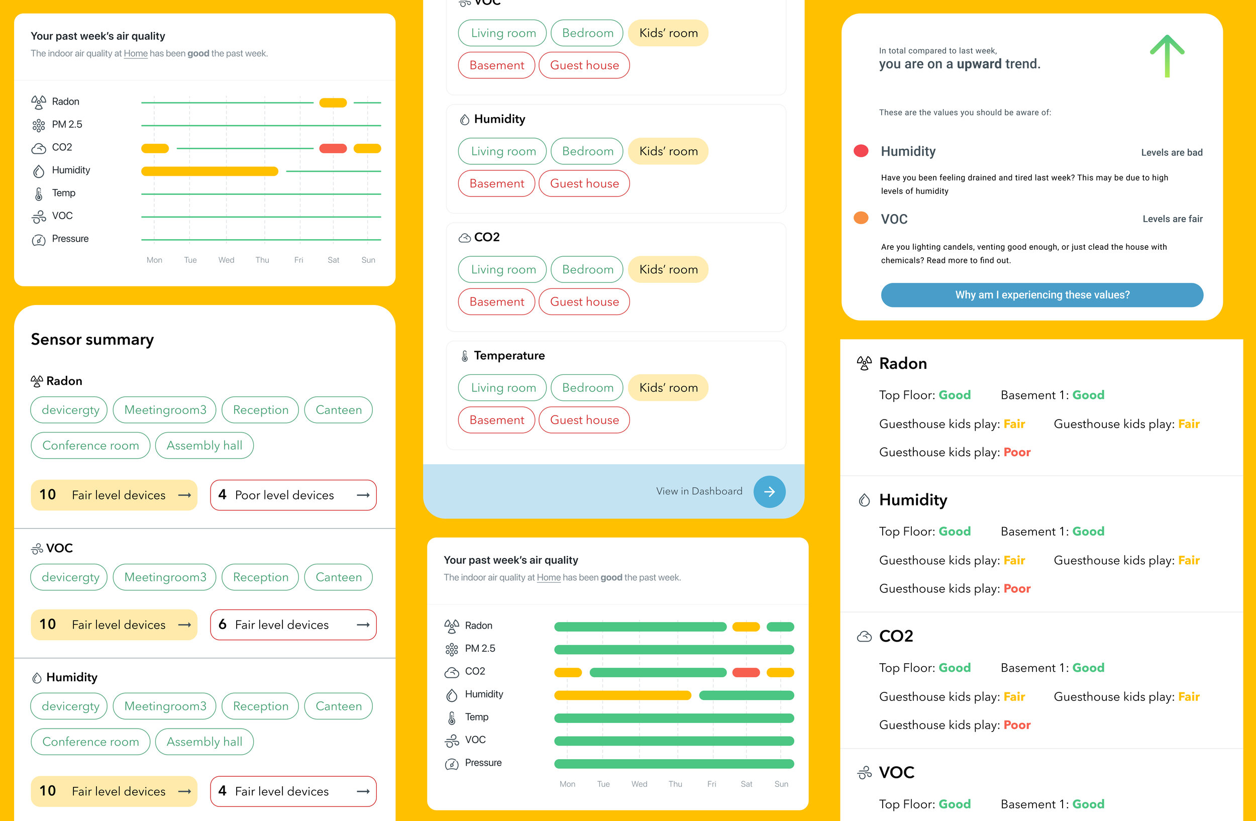
01. Given that emails tend to have a short engagement span, we used the top section to highlight the critical information users needed to know to understand if they needed to take action.
02. We started by only highlighting if users had indoor air quality with a positive or negative trend, but expanded the section to showcase all their devices sorted after the most crucial air quality parameters they needed to be aware of. This was done as users emphasised they wanted a holistic overview of their air quality and to understand which rooms were good and bad.

03. Colours and text were used to highlight if devices measured bad or good air quality levels. The combination of colour and text increased the design’s accessibility, given the prominence of red-green colour blindness.
04. We included individual sections for each key air quality parameter (CO2, humidity, temperature, radon, and VOC) and sorted users’ devices accordingly. Here we highlighted if devices had good or bad measurements for a particular parameter, how values compared last week, and their fluctuation range.
05. Each section included digestible snippets about how certain measurements affected users, to contribute to further education about how measurements specifically affected users and how they could take action to improve their air.
06. These snippets linked to a webpage we had launched to provide more detailed information about each contaminant’s effects and actionable advice. We designed and developed this page to address users’ educational needs and make relevant information intuitive and digestible.

Design iterations
Development process
The team’s biggest hurdles were faced during the development process, forcing me to make several trade-offs in our conceptualised user experience. Issues in development were primarily caused by the need to make an email report viewable in various email clients (Gmail, Outlook, Yahoo, Apple Mail etc.).
Not all clients supported the same technical infrastructure — e.g. lack of support for specific HTML and CSS tags and incompatibility with Javascript — thus, we were required to continuously experiment and research our way towards a universal solution.
This issue was further extended as email clients rendered emails differently on various devices, e.g. Gmail would showcase our solution differently on iPhones and Android devices.
To resolve this, I focused on facilitating a highly iterative development approach. We continuously collaborated with senior stakeholders and users to understand which trade-off to prioritise, solve technical bugs, and strip down the report enough to deliver a valuable universal solution for all email clients.
What I learned
This project provided me with a wide array of experiences and skillsets honing me into a better product manager:
It was a unique opportunity to work across the B2B and B2C space simultaneously and better understand how various user needs overlap and don’t.
The project further provided an excellent opportunity to understand and facilitate the collaborative dynamic required between the designers and developers to launch a product.
Whilst challenges occurred along the way, it gave me a chance to sharpen my ability to make the right design/development tradeoffs and communicate such decisions with the broader team and stakeholders.
It was a great opportunity to further improve my leadership and people management abilities: fostering great team chemistry, expectation management, dealing with setbacks, finding opportunities for better support, and ensuring all individuals were heard.